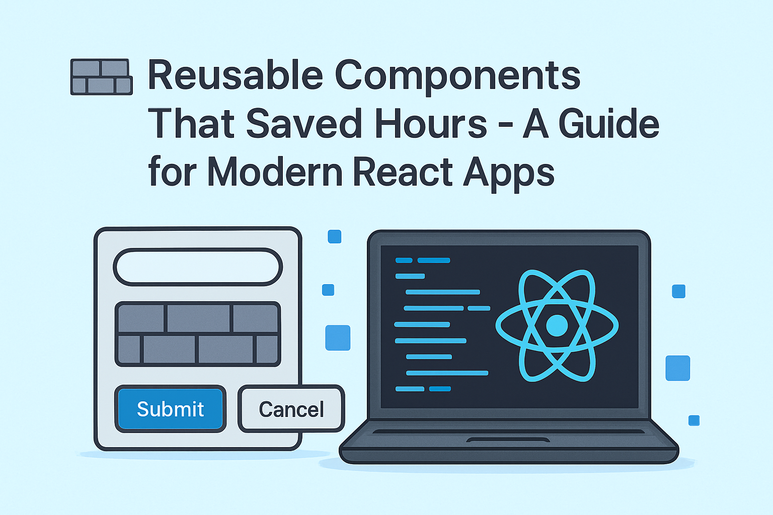
If you’ve worked on more than one frontend project, chances are you’ve written the same input field, button, or modal multiple times.
I’ve been there too — repeating the same code again and again.
But then I realized: Why not turn these into reusable components?
In this post, I’ll share 3 simple but powerful components I use in almost every React project. These aren’t complicated or over-engineered. They’re just:
- Practical
- Easy to reuse
- Tested in real projects
Whether you’re a beginner or a working developer, these components can save you time and keep your UI consistent across the app.
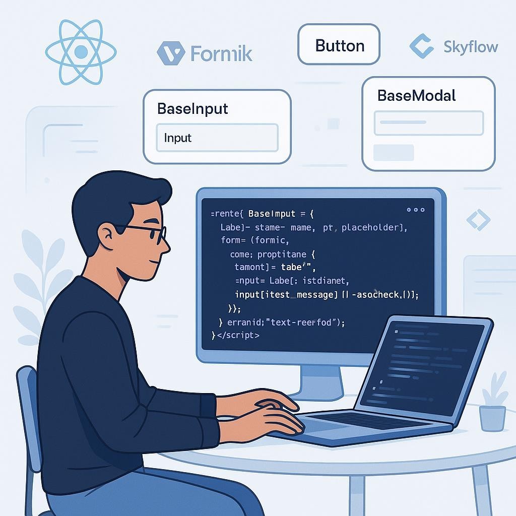
🖁 BaseInput: One Input to Rule Them All
What I used to do:
<input type="text" value={form.values.firstName} onChange={form.handleChange} onBlur={form.handleBlur} />

{form.touched.firstName && form.errors.firstName && (
  <div className="text-red-500">{form.errors.firstName}</div>
}
Now I use:
<BaseInput label="First Name" name="firstName" form={form} placeholder="Enter your first name" />Component:
const BaseInput = ({ label, name, placeholder, form }) => (
  <div className="mb-4">
    <label htmlFor={name}>{label}</label>
    <input
      id={name}
      name={name}
      value={form.values[name]}
      onChange={form.handleChange}
      onBlur={form.handleBlur}
      placeholder={placeholder}
    />
    {form.touched[name] && form.errors[name] && (
      <div className="text-red-500 text-sm">{form.errors[name]}</div>
    )}
  </div>
);
✅ Result: Cleaner JSX, less duplication, and automatic validation handling.
🧬 BaseButton: Variants Made Simple
Old way:
<button className="bg-blue-600 text-white px-4 py-2 rounded hover:bg-blue-700" onClick={handleSubmit}>
  Submit
</button>
Now:
<BaseButton type="submit" label="Submit" />
<BaseButton variant="secondary" label="Cancel" />
Component:
const BaseButton = ({ type = 'button', label, onClick, variant = 'primary' }) => {
  const className =
    variant === 'primary'
      ? 'bg-blue-600 text-white hover:bg-blue-700'
      : 'bg-gray-200 text-black hover:bg-gray-300';

  return (
    <button type={type} className={`px-4 py-2 rounded ${className}`} onClick={onClick}>
      {label}
    </button>
  );
};
✅ Result: Reusable, styled buttons for all use cases — primary, secondary, etc.
🪟 BaseModal: The Plug-and-Play Modal
Usage:
<BaseModal title="Edit Profile" isVisible={isOpen} onClose={handleClose}>
  <ProfileForm />
</BaseModal>
Component:
const BaseModal = ({ title, isVisible, onClose, children }) => {
  if (!isVisible) return null;

  return (
    <div className="fixed inset-0 bg-black bg-opacity-40 flex items-center justify-center z-50">
      <div className="bg-white p-6 rounded-lg shadow-md w-full max-w-md">
        <div className="flex justify-between mb-4">
          <h2>{title}</h2>
          <button onClick={onClose}>✕</button>
        </div>
        {children}
      </div>
    </div>
  );
};
✅ Result: Consistent modal structure that works across the app.
💡 Final Thoughts: Why Reusable Components Matter
Reusable components aren’t just about saving time — they’re about making your app easier to scale, maintain, and grow.
- Faster onboarding for new developers
- Fewer bugs caused by inconsistent layouts or repeated logic
- Easier refactoring when requirements change
If you haven’t already, start small. Build your own mini UI toolkit — buttons, inputs, modals, etc.
🧠 A Thought to Leave You With
“Good developers write code. Great developers write less of it — by writing it better the first time.”
Every hour you spend designing a reusable component is an hour you save in every future project.
And more importantly — your team, your users, and your future self will thank you.
@ Let’s Talk Reusability
What’s one component you always reuse in your projects?
Drop it in the comments — let’s learn from each other! 🚀